Creating some expressive words with illustrator
to do this i just came up with some words that would be cool to create expressively.

My favourite one was the Break so I drew it on paper


I drew a storyboard to show how the animation would break apart

In the first scene the text is normal, in the second scene the text starts to shake, in the third scene the text starts to shake even more and bend and in the final scene the text breaks in half.
Making the Break animation in Flash
I started off by writing the word in flash and then by turning each letter into a symbol in order to be able to animate all the letters.

I then created a shaking animation for the word using a classic tween techniques with Flash and then i made it so it bends to show that it's about to snap and break. After that I created the broken E in illustrator as it was easier to create using illustrator and i ported it to Flash.

I then took each little broken piece of the E and turned them into animatable symbols in oder to animate the breaking motion of the letter.

I finally finished up the animation and by having all the pieces fall to the ground in a mess to really show the broken state of the word.

In the end i think that i made a nice short expressive word animation.
----------------------------------------------------------------------------------------------------------
Making an infographic poster and animation
What is an infographic?
A infographic is a visual representation of information or data, e.g. as a chart or diagram.
It is used to show information about a specific thing in a simple manner that is easy to view and understand.
Why use an infographic?
When you need to show information about a specific subject one of the best ways to show the information is with visual content that represents the info, as it is much easier to visualise data, numbers and quantities through graphical images such as pie charts and diagrams. Infographics are also much easier to understand and remember because of the appealing visuals and designs aspects that the poster or video had.
Infographics are mainly used in presentations to show higher ups or employs information about a specific subject like recent sales or other stuff...
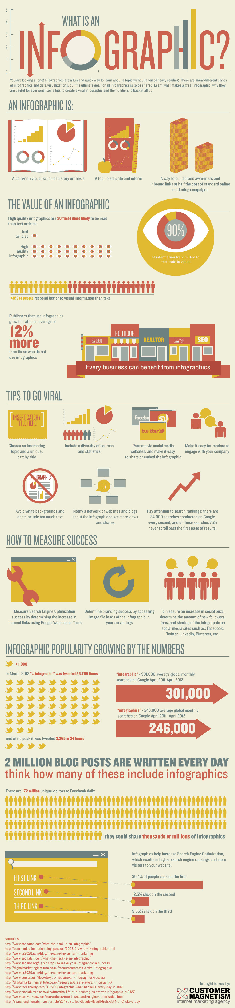
HERE is an example of an infographic that shows info about infographics.
Moodboard of a bunch of different infographics

As you can see inn this moodboard there are many different types of infographics on many different subjects showing lots of information.
Here are an example of 5 good infographic posters that I found during my research.

This is an infographic that shows informations about how much of something on social media websites is created within 60 seconds.
I really like this infographic because it's very visually pleasing and attractive with it's nice and smooth looking graphics and icons and it's very easy to understand with the text and design. It's layout is what's most interesting as it is quite unique and not often used in the process of making infographics, each section of the layout all points towards the 60 second timer showing the viewer that the information happens within 60 seconds which is a great way showing that information. The colours and themes for each section are well chosen for each social media representation.

This is an infographic that shows information and facts about the famous mantis shrimp.
I find this infographic to be very good at showing the data and info in a visual form that looks appealing. The use if dotted lines to separate the information on the page is also very nice. But I am quite surprise to see that there aren't many visual aspects that link the animal to the ocean or sea life that the mantis shrimp lives in which I find quite odd. but I'm not too sure that the layout is that great as I find it to be quite messy at times and the colours of the poster really don't fit with the theme that well which I think is a missed opportunity as the mantis shrimp has some very nice colours.

This infographic shows facts and info about Coffee and mainly talks about how popular coffee is.
This infographic also does a great job at showing data in an appealing visual form that is easy to understand and the choice of colour for this poster is very good as it has that brown coffee look that fits with the theme of the infographic. The spread and layout of the infographic is also quite nice and the info is well divided and compact without looking like a mess.
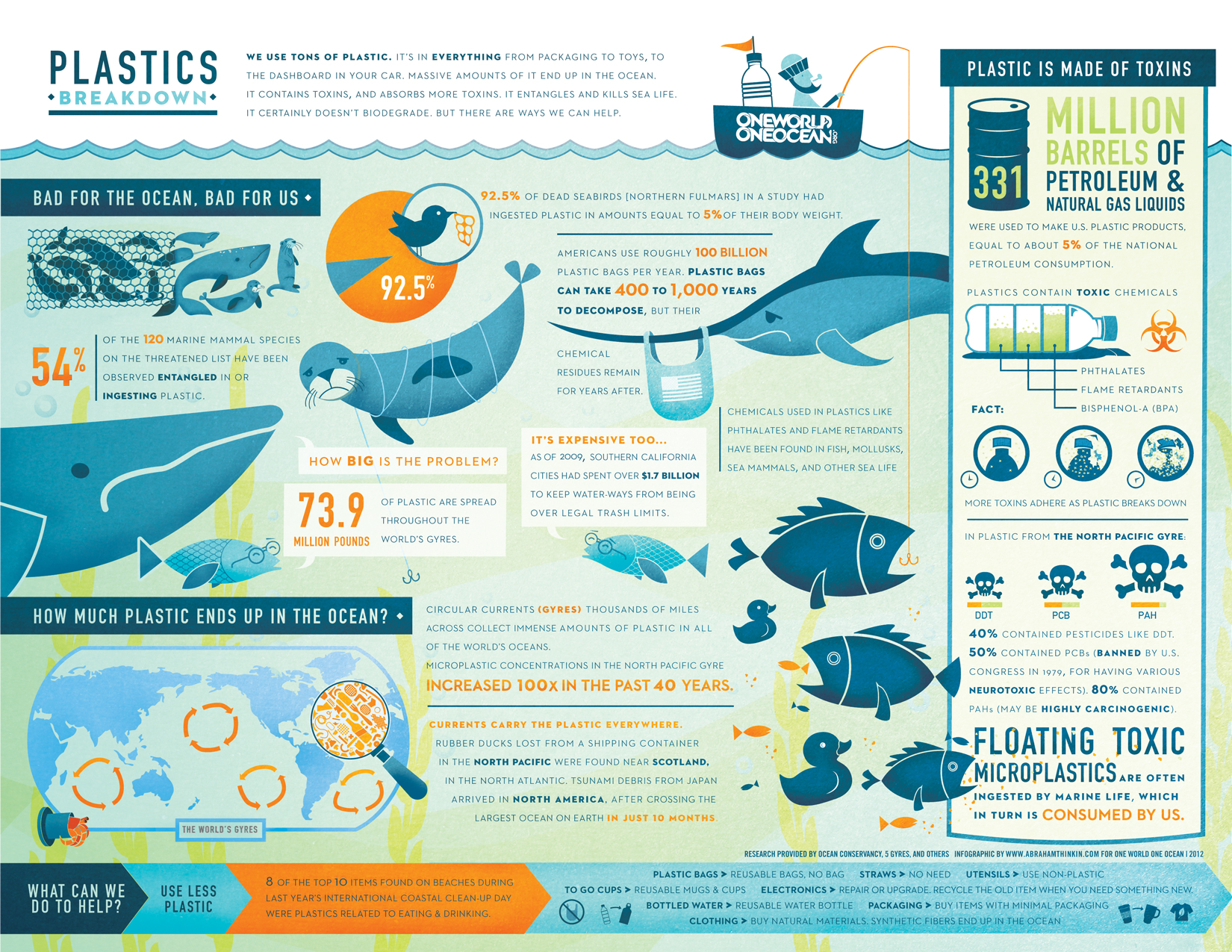
This infographic poster informs about the pollutions of plastics around the world and especially in the oceans. This infographic is great because it informs the viewer about a very big problem in the world that is not commonly talked about it's also a very. the art style of the graphics are also very nice and attract the viewers eyes to the poster which then in turn makes you want to read the informations besides of the graphics. The use of color also goes very well with the theme of the infographic, the blue colors that reprsent oceans and ocean wildlife and the orange that represent s the dangers of pollution even in the text you can see it.

This infographic is more of a fun silly infographic for the fans of the alien film so it's very specific for it's target audience, the infographic shows different information about the xenomorph from the film Alien. The art style of the poster has a nice simple look to it with 4 main colours that go very well together which creates a very appealing look to the poster. Also the layout of the information is very well put with it's main focus on the Physiology of the creature, then a quick list of weapons that could kill the alien to the left of it and underneath the life cycle of the creature. The title is also very nice with a great font style it really stands out.
Looking at infographic animations
Infographics aren't only done as visual posters, they are also made as animated videos.
Just like the poster the animated infographics also go about showing data and information through the use of visual graphics but instead the graphics are animated with some either some text next to the visuals the explain the info or somebody narrating the information. These videos also usually have some nice music to accompany the visuals.
Here are 5 infographic animations that I found to be very good
This video talks about the complicated topic that is bitcoins and explains it pretty well with some very nice visual graphics and a great narrator that explains all the info very well.
I liked this video a lot because it helped me understand the way bitcoins work very well.
Unlike a lot of infographic animations, this animation uses 3D visuals as well as of 2D visuals which makes for a very nice animation. The animation has a very dark like theme to better represent how people use bit coins within the dark, web it's also a part of the style choice which is a cyber/computer like style. Overall this animation looks very cool with it's cyber theme.
This infographic animation talks about the science behind addictions.
What I liked most about this video is that it taught me so much about addiction that I didn't know it served it's purpose at being educational. The art style of this animation is very simple yet very appealing and fun to watch, the use of colours are great and fit the theme of the video and the graphics are also very well done.The narrator is very easy to understand and explains the info perfectly. This animation was entirely made with 2D images using illustrator and adobe after affects.
This video is an add for a business called "Open text"
The video doesn't actually teach you anything (which is a shame) but I liked it because of it's very slick and clean art style that is very visually pleasing and entertaining to watch. The animations in this video are quite impressive and sometimes I can't even figure out how they could be done, it sometimes has a mix between 2D and 3D animations and they look really good. The blue schematic look/style of the animation fitted well with the theme of "Information" and it all looked great. The music also sounded quite interesting but the narrator was kind of boring which isn't great.
Here is a very funny and short infographic animation I found that shows 5 unlikely ways of dying with some stats about the cause of death. The animation has a silent film like style and music to it which looks quite nice and is quite entertaining. The animations and graphics in this video were simple yet fun. The animation is entirely 2D. The only problem I found with this animation was that it was way too short to watch and the information went by way too quickly to actually get the time to read and understand what was going on so on that point it failed but other than that it was quite a good animation.
Now this video is great!
Not only did this video have great infographic animation it also taught me about an important subject that is happening around the world "the problem with oil", it talks about how oil is harder and harder to get as it is a finite resource and that it is time to move on and find a better source for power. The art style in this video was great and fitted well with the theme and it had some very nice animations that were great to watch.
Looking at popular graphic designers
Petros Afshar is a talented Illustrator and graphic designer from London, England, who works primarily in vector. His work is at the same time quite simplistic and very complex with much attention to small detail with many clean graphics and shapes.
I like his work because he manages to show lots of great small detail with many simple clean shape and forms in ways that i had never thought of which inspires me to do something similar for my own project. The choice of colours in his work is also very appealing.
Some of his work


Paul Rand was an American art director and graphic designer, best known for his corporate logo designs. His work was very simplistic and sightly messy in some ways.
Personally i don't understand why this graphic designer was so popular his work doesn't look great, most his work looks like something a child could do in a few minutes, it's not very appealing but i do think that some of his logo designs are well done.
Unfortunately his work doesn't inspire me in any kind of way.
Some of his work


---------------------------------------------------------------------------------------------------------
Proposal
Project introduction
For this project i will be creating an Infographic Poster and animation on Godzilla, in the infographics i will be talking about/illustrating popular Godzilla stats and facts to show people how strong and dangerous Godzilla actually is. First i will work on researching facts and info about Godzilla then i will plan out the poster and animation then i will start creating the visual graphics to finalise the animation and poster.Constraints of the project
The infographic poster constraints are that it has to be in the format of a A3 only, and for the animation the constraint is that it has to be exactly 30 seconds long, no more no less.
context of the project
See research where i talk about 5 different infographic poster and 5 different infographic animations.
Initial ideas for the project
Initially my idea was to research info and facts about my subject (Godzilla) and once i had found my information I would then design an create graphics that fit according to the information and that could be reused for the poster and the animation to save time.
Deliverables
For this project I will need to design and develop preliminary sketches of the poster and create a storyboard for the animation, i will also need to design/figure out and art style for the infographics, I will also need to find a font and colour theme that will fit the style of my subject (Godzilla). I will also need to figure out some animation techniques that would suit my animation style and theme.
Targets and milestones
Investigate brief
research preexisting infographic poster and animations: DONE
Figure out the subject of the infographics: DONE
Research the subject: DONE
Generate ideas
Come up with an art style:
Research potential fonts that would fit the theme:
Design/sketch potential designs and graphics for the infographics:
Make a storyboard for the animation:
Develop ideas
Create graphics/visuals with Illustrator or Photoshop:
animate the visuals in flash or adobe after effects:
Produce outcome
Finalise the poster:
Finalise the animation:
Evaluate Outcome/ Prototype or Solution to problem
Post the animation on youtube:
share the animation and poster with Godzilla fans on reddit and get feedback:
Show the Infographics to anyone who might be interested and get feedback:
Evaluation methods
To evaluate the success of my infographics I will share them with Godzilla fans on the Godzilla subreddit and get feedback and I will also show the animation and poster to anyone who might be interested in seeing it.
-------------------------------------------------------------------------------------------------------
Choosing a subject for my own infographic
I did a quick spider diagram to choose a subject form my infographics this helped me a lot.

After much consideration and drawing a spider diagram of topics I might want to use for my infographic I decided to go with the idea of creating an infographic about the fictional character Godzilla as I am very fond of this classical film monster.
What info will my infographic show about Godzilla?
I was thinking of having my infographic only show stats and info about the creature instead of showing info about the films Godzilla has been in. So for example i can show info about how tall it is, about the cities it has destroyed, the other Kaiju's it has defeated and the special "moves/attacks" it has.
after some consideration I have finally decided that i will have a mix of information about Godzilla, I will talk about some of the films but i will mainly talk about who and what Godzilla is and why he is one of the strongest film monsters of all time.
Here is a list of the things I might talk about within my infographic:
- How Godzilla's height has changed over the course of the films
- It's special "moves"/abilities
- some of it's popular enemies
- some of the cities it has destroyed
- How Godzilla was created/ origins
- Different ways in which the humans tried to kill Godzilla
Some random info/facts that i found on Godzilla that could possibly be used:
- Godzilla has a Hollywood star on the walk of fame
- There have been 30 Godzilla movies — 28 Japanese ones and two American productions.
- size of Godzilla: 108.2M. Godzilla's size has been very inconsistent throughout the films as film directors have made him taller and taller to fit the general size of modern skyscrapers.
- Godzilla's weight in the 2014 film: 90,000 tones
- Godzilla has displayed varied levels of physical strength that are, at the very least, sufficient enough to lift weights exceeding 2,000 tons and smash skyscrapers.
- Godzilla possesses gills/amphibious lungs so he can stay underwater indefinitely, but he closes them when he's on land and uses his lungs.
- “Gojira” (conjunction of the words “whale” and “gorilla”)
- Godzilla has been around for 60+ years (62)
- Over the last 60+ years that Godzilla has been around there has been 30 official films that have been made.
- Godzilla's Origins: In most Godzilla films Godzilla is said to be a prehistoric creature that has been mutated by human nuclear weapons such as the H-bomb.
Here is a quick list of some of the cities that have been destroyed multiple times by Godzilla:
Wiki defintion of Kaiju: Kaiju (怪獣 kaijū ?) is a Japanese word that means "strange creature," but often translated in English as "monster" or "giant monster". It is used to refer to the kaiju genre of tokusatsu entertainment.
- Tokyo - 12 times
- NewYork City - 3 times
- Osaka - 2 times
- Paris - 2 times
- All the other cities after this have only been attacked by Godzilla once
Wiki defintion of Kaiju: Kaiju (怪獣 kaijū ?) is a Japanese word that means "strange creature," but often translated in English as "monster" or "giant monster". It is used to refer to the kaiju genre of tokusatsu entertainment.
Quote that I like:
"He is nature incarnate, he is the wrath of God, he is the King of the Monsters, he is Godzilla."
In other words this quote simply explains what Godzilla is; a force of nature that cannot be stopped.
writing out most of what I know about Godzilla:
GODZILLA the king of the monsters! What is he?
In most Godzilla films, Godzilla is said to be a prehistoric dinosaur like creature that has been mutated from nuclear weapon tests such as the H-bomb.
He had been "hibernating"/living in the deep oceans for thousands of years and only comes out when he is bothered or when other kaiju like creatures are stomping around on earth so he can confront them and keep his title of being "the king of the monsters".
What can he do? Godzilla is one of the strongest if not the strongest kaiju out there, with enough strength to lift weights exceeding 2,000 tons and smash through skyscrapers with ease. He has extremely tough skin that allows him to withstand all kinds of attacks including rifle shots, hits dealing massive amounts of weight/damage and nuclear bombs. He also has regenerative healing abilities that has saved his life many times and of course he has his iconic special ability/move his "atomic breath" which is a powerful blue beam of concentrated radiation that Godzilla can shout out of his mouth.
Godzilla films mainly consist of giant "epic" monster fights with Godzilla going up against 1 or multiple monsters, usually the fights happen within Japanese city's. Most of the time Godzilla comes out victorious in the fights be it has happened that Godzilla has been defeated or even killed in certain films.
Most of the info i found was mainly from the website WikiZilla which is a wiki page all about Godzilla films and monsters.
what info should the animation include:
what info should the poster include: I have decided that in the poster I will have information about Godzilla's different sizes, his popular foes and enemies, abilities and some film info.
Now it's time to come up with an art styles for the infographics.
I started off by looking at preexisting Godzilla art in google i quickly realised that most of Godzilla's art is quite complex and detailed so I searched up minimalist Godzilla art to find a simpler art style that would be easier for me to create as I'm not a very skilled "artist".
Here is a quick moodboard of some of the minimalist Godzilla art I found and liked.


The main idea of this kind of art style is that it stays simple with the character's silhouette so it's quite simple to make and it can usually look pretty good if done right with good colours.
I did a quick drawing of the big G ... because I could.
I did a quick drawing of the big G ... because I could.

2 Very early rough sketches of the layouts, these were done just to get a quick and simple idea of how I might present the information in my infographic poster


I then started to quickly come up with some designs that would incorporate all the info that I wanted to show within the poster.
The 5 sections in each of these designs are: Title, Godzilla's abilities, size chart, film facts, Godzilla's enemies, and an illustration of Godzilla in the biggest section.
Here are my 4 main designs.
The 5 sections in each of these designs are: Title, Godzilla's abilities, size chart, film facts, Godzilla's enemies, and an illustration of Godzilla in the biggest section.
Here are my 4 main designs.


Out of my 4 main designs I decided to go with the first layout and further design to give it more depth and style to get an even better idea of how it's all going to fit together.
I decided to have Godzilla shown in the middle of the infographic while being surrounded by destroyed building silhouettes with the info shown on them.


Here is another Godzilla poster layout sketch that i might further develop for my final poster.
It shows Tokyo being attacked by Godzilla from the right and the information would be shown below the city.


Making visual graphics for the poster and animation
Here are some graphics of Godzilla that i made to be potentially used for the animation or poster.
The first 3 Godzilla's at the top were created by tracing an image of Godzilla that I found on google images. The sketches were drawn to get a more personalised and stylised Godzilla of my own design. And the Godzilla head that is doing the atomic breath was also traced from a preexisting image.

These 2 Godzilla busts were created off of the sketches I drew, the one on the left is sharper and the one on the left is rounder. The one on the left looks nicer and more organic.

Making small simple icons of Godzilla's special abilities.
These will be used next to the info about Godzilla's abilities.

The powers shown here is Swimming, tail whip, atomic breath and Regeneration powers healing powers.

I soon after realised that the tail whip icon could look better with only one tail showing the movement and for the regeneration power icon a colleague said that it would look better if the medic icon wasn't as big, but for now i'm not to sure on that new design.

Making mount Fuji to be possibly used in the poster background
trying out something diffrent


For fun I decided to create a Godzilla basketball team logo.


Making an atomic missile graphic


Making the postertrying out something diffrent

Here i was trying to get a specific style that i thought might look good but after making it i didn't like it at all, but it was a good attempt at experimenting.

I then went on to creating a more detailed Godzilla with a style that I was much happier with.
To make this graphic I used a photo of Godzilla from one of his movies and I traced all his major bodies parts separately, I then colour coded each part and put them all together to form the silhouette of the monster. To finalise it i added extra detail to make it pop out a bit more and seem a lot more appealing.
Different variations of Godzilla

after making the first version of Godzilla i wasn't happy with the boring grey colours so i changed them with the use of the adjust colour balance tool in Illustrator. This helped me get a wide range of different coloured Godzillas that might fit better within my poster. I ended up choosing the bluish greyish one on the left.
making a new city

After making Godzilla it was now time to create a city for it to destroy.
I took some reference of how Tokyo looked on google chrome and then i had a look at how silhouette city images look best. I realised that in order to make a good looking city silhouette you needed to create an illusion of depth in order to make it look more appealing, to do this I made lighter grey building blocks and i placed them behind the main darker buildings at the front. To finish this i just repeated the process and place the buildings in different ways.

After making the Godzilla graphic i was testing the placement of Godzilla's arm and after changing it's placement i thought that it look like he could be holding a ball in his hand from the way he was positioned, so I made a quick basket ball and i gave it to him and it looked funny. I showed it to a colleague and he told me that i should create a Godzilla basket ball logo with it just for fun... so i did and it was very fun and easy to make.
Making the size chart

To make these silhouettes I used a preexisting size chart as reference and I traced the Godzilla's that I wanted to use for my own size chart. doing this was fairly simple as I mainly just used the pen tool in illustrator. I then aligned them up in the order of time period and I added a size graph line to show the general height of the monsters and then i added the time periods underneath the monsters to show what era they were from.

I later realised that a black on white size chart didn't fit well in the dark section of my poster so I inverted the colours to white on black and it became so much better looking on my poster.

I wanted to find i way to show how Godzilla attained his powers of mass destruction with an atomic missile graphic that i could maybe fit in with his origin story that i was going to write. But after adding it to the poster it just didn't fit in any way so I didn't end up using this.
It was very simple to make, i just used an oval and cut it at the bottom and then added the wing bit's that were made with the pen tool. I thought that I could possibly use this for my animation.

quick experiment to try and make the missile graphic look better.
Very quick and rough mockup of how I want the final poster to be like.
This helps to get a better visualisation on how the end design will look like.
This helps to get a better visualisation on how the end design will look like.

Making the destroyed city silhouette

Making the buildings look broken was fairly difficult to do and in the end i'm not very happy with the way it looks.


After making this I have started to consider making my poster with a different layout/design. i was really unhappy with the way it looked and I couldn't come up with any good ideas on how i could present info on to it.
I then went with my mount fuji over Tokyo being attacked by Godzilla idea.
I first started with a quick mokup as usual and i wasn't too sure of it at first but i quickly came to think it was a better idea as i had more space to present informational text and such.

After that i use the mockup and inserted Godzilla and the city (This was when i was still experimenting with Godzilla's colours).

I still wasn't quite happy with the way the poster felt in terms of colour.

I changed the sky to a grey colour to make it more in theme with the idea that the city is in danger instead of a happy blue sky. I then added the Japanese sun/flag symbol to represent the country.
and i started to add the title.

I went on to playing around with the placement of certain buildings in order to get a good view in the monster. I decided that the sun was a great place to put the title as it was in the centre of the image. added the mini godzillas.

I then started to place more information to get a better idea of the final look of the poster. the size chart that is there is only placeholder as I didn't make it. The poster was finally starting to take shape.

After that i started to readjust everything to look more stylised and fit in better. I also change the placement of the centre building as it looked off before. I was still unsure about the font of most of the text and I eventually wanted to change it.
The final Godzilla Infographic Poster

To finalise the poster I ended it up with some extra polishing and small adjustments here and there. I changed all the informational text to a font called "Animal Silence" and removed some things and added other.
Overall I'm very happy with the way my final Infographic poster looks. I think it shows and describes Godzilla really well, it really show that he is the "King of monsters!".
-------------------------------------------------------------------------------------------------------
Making the animation
According to the brief my animation needs to be exactly 30 seconds long which limits the amount of information I can show in my animation.
So first I need to figure out what information I want to include in my animation
My Infographic animation is going to be about Godzilla's stats (weight, height, age?...etc) and his abilities, like the abilities I showed in my infographic poster.
Making a Storyboard
By making a storyboard it will happy get a better idea of how the animation will play out and how it should be made. I ended up doing 2 storyboards because I was so unsure of what my animation should be like.

While making my first storyboard I realised that I had planned out way too much and that I wouldn't of had enough time to show off all the info in 30 seconds so I scrapped this storyboard and went on to doing something a lot more simpler and easier to do.

In the end I just decided that i would just show off all 4 of Godzilla's special abilities with some simple animations as i didn't have the time to make anything too complex.

I started off the animation with the into and title sequence where you see Godzilla stomping through the city like in my poster. To make the animation of Godzilla stomping through the city i used basic tween animation.

In Adobe Illustrator I planned out the different parts of the simple looking Godzilla. I did this in order to be able to animate all the different body parts separately to create realistic movements.

For his first ability that I will show off in the animation, I will show his healing factor.
The animation will be shown as Godzilla being hit by nuclear bombs and then regenerating his health.
The animation was entirely made with some simple tweens, something that was tricky to make was the explosion as it had to look like a simple explosion instead of a growing ball.

For his second ability that I will show off in the animation, I will show his water breathing powers.
The animation will be shown as water coming up into the scene, and then Godzilla's back coming out from under the water and then dive back in, he will then come out of the water head first to then walk away. This animation was fairly simple to make, to make it i had to create some separate and new images such as Godzilla's back and the water splash.

For his third ability that I will show off in the animation, I will show his tail attack.
The animation will show Godzilla attacking and destroying a building with his tail.
This animation was a lot harder to do then the lasts one because I wasn't to sure on how to animate the tail, I ended up by having his tail change shape while moving.

For his last ability that I will show off in the animation, I will show his atomic breathe.
The animation will show Godzilla attacking and destroying a building atomic breathe attack.
This animation was also quite hard to make as I needed to make him move in a very specific way for him to blast out his breathe.
The final animation
The final animation looks OK but that's about it i'm not the proudest of this animation and I really think I could of then better if I wasn't restricted to 30 seconds and if I also had more time than a week to make.
Final evaluation
Overall I think I approached the design cycle pretty well and that I did a decent job a coming up with ideas and then realising them. The poster was at times tricky to make as I would sometimes run out of ideas on displaying information put i managed to get it done to a very good standard, although i did take a bit too much time on working on the poster instead of the animation. For the animation i think i did an ok job at it, like i said before i'm not very happy with it but it's the best i could do within a week for a 30 second long animation.
If i had more time to make the animation i would of definitely made some of the animation a lot more smoother and i also would of created a nice background for when Godzilla was showing his abilities.
Comments on audience response
Commenter #1: I like the animations of Godzilla but the transitions happen to quickly and the font is a little hard to read but overall I enjoyed it.
Commenter #2:
After getting my animation reviewed and commented, i totally agree with what they had to say, the animation is very fast, and you don't get the time to understand everything, but that's because i was stuck with making only 30 seconds long.