Unit 34 Image Manipulation Computer Applications
In this unit we will be learning how to manipulate images using Photoshop.
Making a face out of different fruit and vegetables

Making an image with a blurry background.


Beetle in a coffee cup
In this image i edited in a bettle into a coffe cup by using various different photoshop techniques.

Elephant in a rounded bottle
In this picture i made it look like there is a small elephant inside a glass bottle.
In this picture i made it look like there is a small elephant inside a glass bottle.

Changing the RGB levels of an image to make it look better and more colourful.


Changing the colour of a specific section in an image and making the rest of the image black and white.

In this image i made the turned the whole picture black and white and then i changed the colour of one bird blue using the brush tool with the color mode.

In this image i selected one of the birds and cut it out of the image and then turned the image to black and white making only one single bird coloured.
In this image i wrote the word hello on a foggy window with a paintbrush and made it look like somebody wrote the word with their finger also the city you can see through the window is fake

Making small planets like image with the help of Photoshop and panoramic images


Took an image of some random person on the web and distorted it by cutting it up in squares with photoshop

Went out to the park to find some leafs to scan and
manipulate in Photoshop this is what i made with them.


Following a tutorial to make a nice planet road collage thing.

Made my own fake alien ufo attack image with the help of images found on the web.
This was fun to make.

By following a Photoshop tutorial I made this small tv.
Tutorial HERE

Making an abstract collage by following THIS tutorial

Started of with a paper texture and changed it colour then added a round shape to create a ground.

Added in a weird abstract thing that i had previously coloured.

added in a paint texture and some warmer colours to make it look more vibrant.

aded some legs to the abstract thing

drew some lines on the ground to show more depth

added in the words bird cage to the collage, the B and the C were both created in illustrator and the hand writing was written and the scanned in by me

added in some weird cones in the background to make the world look even more abstract


And to finish it off i added in some extra weird creatures to the collage
Making a second collage from what we learnt by doing the tutorial
I started off by finding a non coloured drawing on google images.

I then coloured the drawing in Photoshop.

I then found a nice coloured paper texture
to use as the main background.

Added in the coloured samurai drawing and changed some
of the colour levels and settings to make it look warmer.

I found an image of water coloured blossomed cherry
tree on google images and i thought it would go well with
the collage so i added it in and then painted a ground
for the images to be on.

changed the ground to a grass texture as it would look more natural and nicer.
And i added shadows for the tree and main character, the shadows were made by taking the silhouette of the objects and then putting them in the right position to make the effect believable.
And i added shadows for the tree and main character, the shadows were made by taking the silhouette of the objects and then putting them in the right position to make the effect believable.

and i finally added in some clouds to fill in the top part of the image
the clouds were modified and set to overlay.

Overall i am quite happy with the way it turned out and i really like the way the shadows look.
Making a type scene in Photoshop
This was made using a skin texture and a photograph of some meat.

Type scene mood board

making my own type scenes
Making the main background with a brown radial gradient

adding a ground earthy texture

adding the letters with some effects

Adding a texture over the letters to make them look like they are made of bark.

Main radial blue background

Adding a water background

Adding the letters with some effects

Adding in the fish texture/body on the letters

Adding in the head and tail of the fish on both sides of the word to make a fish cut out into letters.

Remaking a collage with photoshop without a step by step tutorial.
The original is to the left and mine is to the right.


Taking photos around bristol and then making a collage out of them using photoshop.
Most of these image were taken around the M shed.

making a collage with the help of a tutorial but not following all of the steps.
tutorial HERE

Photoshop collage made with the help of THIS tutorial

Another collage done in Photoshop thanks to a tutorial
I'm not a big fan of the way this looks.

Nature collages mood boards


Moodboard of the images i took at Ashton Down with Dylan

A manipulated image of trees edited by Dylan Otterbeck

Quick sketches to plan out what I'm going to do for my collage.
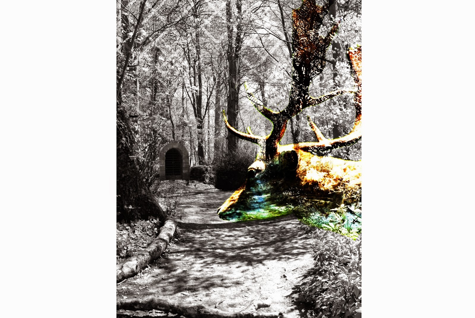
At first i didn't quite know what I wanted to do but i was sure that I was going to add in a dear or two the collage so I sketched image/layouts with dears in them.


This is the sketch i end up going with.

The collage I made with the help of a few of the images
I took at Ashton Down and the sketch I drew
I first chose what Photo would serve as the main image/background

I then decided that it would look good in
black and white so I changed it to black and white

I added in the dear head and changed it to overlay

I then experimented with some geometric shapes

I added the geometric shapes at the top of the collage fading downwards

And then to finish it off i added the stone gateway in the far distance
~~~~~~~~~~~~~~~~~~~~~~~~~~~~~~~~~~~~~~~~~~~~~~~~~~~~~~~~~~~~
Making a festival poster for Womad
Researching what a Womad poster looks like and what it should contain.


Looking at different types to see what kind of types would fit the poster well.

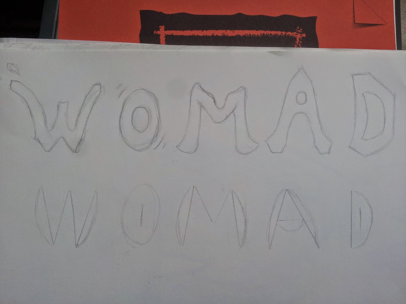


Making one of my ideas with Photoshop


Learning how to do the tilt shift blur technique on Photoshop
here are my results


Increasing the brightness and vibrant of the image and then giving it a tilt shift blur effect.

added in a quick definition of the festival name with the Keep Calm font.


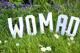
The final poster with Added logos of companies that sponsor the festival and an added blur to the tilt shift technique.

Making a festival poster for Womad
Researching what a Womad poster looks like and what it should contain.
After researching the different Womad poster i have seen a common pattern/theme, the poster should show some of these things: dance, music, art and different cultures as it is a very cultural festival that is carried out around the world.
Looking at different cultural patterns from around the world that could be used for inspiration on making my poster.
Sketching up some custom typefaces but sadly I'm not happy with any of them.
Sketching up some ideas of what the poster could look like.
This first sketch shows the idea of taking a photograph of some paper crafted letters with flat paper people, clouds and sun. I think this would be a good idea if i create it.
This second sketch shows the world being eaten by a lion, I don't know why but I thought it would be a good idea but at least it's not a bad one.
Trying out an effect on it but it didn't seem that good of an idea after doing it
quickly added in a title and logo but in the end i wasn't happy with this idea.
this was a quick test of an idea i had but ended up not going with it.
Learning how to do the tilt shift blur technique on Photoshop
here are my results
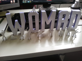
Drawing small people to then cut them out to add them with my paper craft letters to give a better idea that the poster is about a festival.
I ended up not using the small people even thought it was a good idea the problem with them is that they didn't stand up in grass.
What would of been nice instead would be some small toys of people dancing and playing as they could of been set in the grass

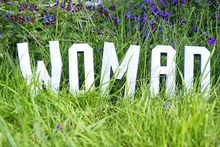
Taking different photos of the letters in different ways and places


Making the final poster
Choosing the right photo to edit.

Increasing the brightness and vibrant of the image and then giving it a tilt shift blur effect.

added in a quick definition of the festival name with the Keep Calm font.

Playing around with the text and sponsors.


The final poster with Added logos of companies that sponsor the festival and an added blur to the tilt shift technique.

Overall i think that the poster turned out pretty good and i had fun making it which is always a bonus.
Final Project of this Unit
In this final part of the unit we will be making 2 collages around a specific theme of our choice and it needs to represent a symbolic idea.
I decided to base my theme on a piece of street art that Banksy made.


 started of by finding a good rock shape to use as the base
 cut the rock out of the image and played around with it
 Duplicated it a few times to create a nice symmetrical base.
 Added in the castle I was going to use
 I erased all the unnecessary parts of the photo with a soft brush
 Added in a sky for the background to give a better sense of it floating in the sky
 Added in some images of clouds and some vegetation down the side of the rock base

 Found a nice image of a bat on a black background
 I cut out the bat with the magic wand tool
 I added a nice night time moonlight background
 duplicated the clouds of the background and brought them in front of the bat
 Found a good images of a star night sky and overlay it on the sky of the background to add to the atmosphere of the piece
 Added the castle on the back of the bat

 Found a nice bat that was higher quality
 Got the castle from Disneyland and edited it to fit on the bat


 I first looked around on the internet to find i nice image of a falcon soaring through the sky.

 I edited the castle image and i placed it on the back of the bird
 I then searched for an image of the sky with clouds


 I cut it out of the image


I looked for a good background that would fit the theme


 After cutting out the camera to replace it with a cctv camera i needed to find a way to replace the back leg
 So i just copied the other back leg and made it darker as it had shadow casting over it


I wanted to add some kind of monster to add more story to the collage so that the flying tower could have a reason to be filming.


I then added a old metal texture to the background

I then played around with the way i would add the drawing


Final Project of this Unit
In this final part of the unit we will be making 2 collages around a specific theme of our choice and it needs to represent a symbolic idea.
I decided to base my theme on a piece of street art that Banksy made.

It says "You don't need planning permission to build castles in the sky" and I thought that it was such a great phrase that i wanted to create some kind of collage to represent the idea of people creating flying devices or other things to be able to build buildings in the sky or any other place were you wouldn't need planning permission.
My proposal

Mood board on different collage that fit the theme

Some research on different collages that fit the theme.


Maggie Taylor art critique

Sketching some ideas for the castle in the sky collage
My main and favourite idea is to create a collage showing the castle on the back of a flying creature of some sort like a bird or a bat.


Just a quick idea and sketch on Photoshop

Making a collage of a rock based castle in sky.


The final piece with a few more clouds
I like this on a lot, it's nice and simple but it was only made as a basic test.
The bat idea collage


made the sky and castle brighter
I then realised that the castle looked way too dim and badly lit and i also didn't like how low quality the bat was so I got rid of both elements to do them again.


Made the castle and the bat darker for it too fit better in the composition

and then a finally made the whole image a little bit brighter.
I call this collage "Dracula's Flying Castle"
In the end i wasn't happy with this collage so i continued making other ones.
I didn't like it mainly because of the lighting and low res pictures i used.
Making one of the 2 final collages for this part of the unit.


and then i looked for a great image of a castle that would fit well on top of the falcon


Added some more land to the bird. The new land has sheep and a tree on it.

I thought that it would look cool to add some more environmental terrain to the bird and make it look like the birds armour so i gave the bird a helmet made of rocks.

Changed the background as i didn't think the last fitted that well

I edited the bird's stone helmet as it was too chunky.
i thought it would be funny to have the falcon holding on to prey so i gave it a new pair of legs so it could hold a whale. The whale also helps the viewer to understand how big the bird is.

readjusted the legs and whale.

I thought that it wouldn't make sens if the falcon was carrying a whale when there is no ocean nearby so i changed the background once again.
Played around with some textures


I drew a map to add in the background of the image so it would look like one of those movie scenes where the map fades in to show were the heros are travelling.

I gave my map an old paper texture to make it more authentic.

added the map in

faded the map into the background and i made sure it wouldn't hide the ocean

i wasn't quite happy with the way my compass looked so i added an image of a compass that i found online.

The other day i went for a walk and found some feathers. I thought these might come in handy with my bird collage.
Final image

I then finally added the feathers for more of an atmospheric addition and i so changed the brightness and final colours of the whole image.
I call this collage "A Limitless Adventure"
I am actually quite happy with the final outcome and i really like the idea of having a castle on a giant eagle. If i would improve i needed to improve it i think the map in the background cloud have been drawn a bit better and i would of also chosen a bigger and better castle but other than that i think it looks really good.
And what i really like about this collage is that it tells a story.
Here is a mood board of some photos I took thinking that it could be useful for the next collage but in the end I didn't end up using any of these photos.

Making the second final collage
At first i was thinking of making a church like castle floating in the sky with a giant gargoyle statue but i changed my mind and went for something a bit more futuristic.
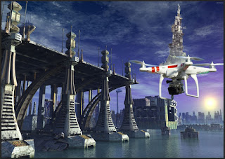
I went online to find a picture of a quadcopter drone.
And I found this great picture of a phantom drone.


I then searched for a good futuristic looking castle and found this nice painted futuristic castle/tower.

i cut out the tower and moved it onto the drone

I looked for a good background that would fit the theme

But then i decided that it would look fine in new york

flipped the background so that the drone isn't hiding the tallest building.


I gave the done a better looking camera

And then i added some satellite dishes on the tower
I wanted to add some kind of monster to add more story to the collage so that the flying tower could have a reason to be filming.

So i sketched a few monsters

I found that this one would fit the collage best

cut it out

and the i painted it digitally

I then added it into the collage

I made the building on the left taller so that the back of the monster could be hidden.
And at this point i got stuck as i wasn't happy with the composition of the piece so i totally scrapped the idea of having the castle film a monster attack and chose to present the castle in another format where it would be standing out more.


added a new city background and again it's new york

I wanted to give the city some kind of cool effect to show that the castle is really flying over

added a sky

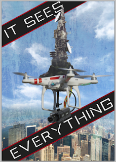
changed the effect on the city and i gave the drone a small triangle symbol that is supposed to represent the illuminati.

I added some banners for text

added the text with a type called Xperia
I put the words "It sees everything" to show the viewer that this castle in the sky has a lot of power

I then added a old metal texture to the background

I drew the illuminati symbol so i could add it to the collage
I then played around with the way i would add the drawing


Final Image

I was then told that the collage would look better without the text as it was already obvious of what was happening and that the illuminati drawing would look better in the background.
I call this one "A Conspiracy Theory"
At first when making this collage i had no plans at all on making it have anything to do with the illuminati but while i was making it i thought that this would be the perfect vehicle/base of operations for the illuminati so that they could spy on everyone with the giant camera.
I really like this collage because it gives another idea/theory about how the illuminati are superior and know everything.
Design Report Unit 34
In this Unit we learned how to use Photoshop to create
photo-manipulated artwork. We first started off by doing and learning from
basic Photoshop tutorials which was easy but then we moved on to more
intermediate and professional type of work and we made a festival poster for a
festival called Womad. After having done Unit 4 I already had a basic idea on
how to make festival poster so I applied my previous knowledge to making this
poster.
I started of by doing some research on what other poster had
been previously made for this festival, by doing this I discovered what kind of
a festival this was and it was a nice chilled out weekend family friendly type
of festival were you would go to meet new people and chill out in the grass
while listening to music, I also discovered that it was a world wide festival
that happened in many other countries. This festival had a lion mascot and my
primary idea was to create a festival poster with the lion as a primary element
so I sketched out some designs and layouts for the posters. I had 2 main ideas
the first one was to have a lion with the world in it’s mouth and my second
idea was to have the Womad letters paper-crafted and cut out and placed next to
some paper silhouettes of people having fun. So I started of in Photoshop and
tried to recreate my lion eating the world sketch, but every time I would
recreate it I wasn’t happy with the outcome so I tried something else I put the
lion standing on top of the world, but again the outcome wasn’t how I wanted it
to look. So I gave up on the idea of using the lion and went on to making my
second idea the paper-crafted letters. On the Internet I found a template of
some paper craft 3D letters I could print out and make myself, so I did so. After
making the letters it was time to create the people dancing and having fun. So
I did a bunch of sketches of silhouettes in different poses and I cut them out and
created stands for them so I could make them stand up. I then needed to find a
suitable background for this poster and I thought that it would be a great idea
to put the letters in the grass as the festival in England is always in a
grassy field. So I borrowed a camera from the college and waited for the
perfect day to take some nice photos of the letters in he grass, unfortunately
I couldn’t use the paper silhouettes I cut out, as they wouldn’t stand still in
the grass with the wind blowing, so I had to do with out them. After taking a
bunch of photos I chose he best one and edited it in Photoshop to make it look
more vivid and alive. In Photoshop I changed the brightness, contrast and
vibrance and then I gave the photo a tilt shift effect to make it look like
some kind of miniature letters and to also focus the viewers attention to the
main element of the picture. After does edits the photo now looked great so all
I decided to do was add some info such as sponsors, Logo and the website.
Overall I am very pleased with the final outcome of my Womad Poster and I don’t
really know how I could of made it better.
After this part of the unit I was tasked to create 2 collages
with a theme of my choice. After a while of thinking of a theme for my collages
I thought of making collages based off of a banks artwork that says “You don’t
need planning permission to build castles in the sky” and I really like the
message of this. So I decided to create collages of castles in the sky. Before
I started my collages I did some research on other collages that had the same
theme, doing this research only helped with getting some extra inspiration. I
then sketched out some ideas/layouts on how I wanted my collages to look.
My first idea was to
have a giant bird with some land and a castle on it’s back, I really liked this
idea, as it was very fantasy based idea and I thought that it would look really
cool. My second idea was similar to my first but instead of using a giant bird
it would be a giant bat with a Dracula like castle on the back of it. And my
third idea was to have the castle on some kind of machinery with propellers to
keep it flying in the air. I also drew a quick sketch of a funny looking bird
with a castle on it’s back in Photoshop but that was mainly just for fun. After
that I thought that It would be good to just make a basic/typical floating
castle on a rock type of collage, this was very simple to make and I only used
photos found on the internet, the process of making it was easy as it was
mainly just cut out, resize and move and a little bit of the stamp tool. But
after doing this first collage I had already I better idea on how I was going
to produce the final ones so it did help and the end result looked pretty good.
I then went on to trying to make Dracula’s flying castle. I started this off by
looking for a picture of a bat; unfortunately the picture I chose was low resolution
and didn’t look very nice, I then added some clouds with a moon, I made the sky
look more interesting by making it lit up with stars. I increased the amount of
clouds and made the bat slightly inside of the clouds to make it look like it
was rising from out of the dark clouds. And then I added the castle on the bats
back; the problem with this castle was that it was already too dark. I wasn’t
happy with the way the bat and the castle looked as the bat was low resolution
and the castle was too dark so I got rid of both of them and then I replaced them
with better images, this meant that I had to change the placement of the moon
as the new bat had longer wings. The new castle was the castle from Disneyland and
I gave it a blue tint on its side to show that the moonlight is glowing on to
it. Overall I’m still not all that happy with the final outcome. But hey, it
was a good attempt and I didn’t dislike making it.
I then started to make the castle on bird idea. I started off
by looking for an image of a bird of prey that was flying and that you could
see it’s back easily and after a while of searching a found this image of a
Falcon that was soaring through the sky, which was perfect. After that I needed
to find a castle that would fit well on top of the bird’s back. After that I
cut both images out and put them together on a sky background. By using a soft
brush I erased the bottom of the castle so it would look like it was nicely
sitting on the birds back and then I flipped the castle so that it would look
nicer. I thought there wasn’t enough grassland on the back of the bird so I
added some more. I added a field with a tree and some sheep next to the castle.
I then decided that I wanted to add some more cosmetic terrain elements to the
bird so I gave the bird some kind of protection a stone “helmet”, I found an
image of some rocky terrain and I cut it and blended it on the top of the
bird’s head, I thought that it looked good. I then changed the background image
to another sky image, as I wasn’t happy with the previous one. After doing that
I thought that the bird’s stone “helmet” looked to clunky/chunky so a trimmed
it down and added some more of the rocky terrain around the birds back, it
looked a lot better after I did this. I then wanted to add extra story element
to it, I wanted the bird of prey to be on a hunting trip of some kind so I
decided to give the bird some better legs and some prey in it’s claws. So I
looked for some images of eagle claw holding on to fish and after some
searching I found a good pair of claws but they weren’t of the right color so I
just changed the color in Photoshop so it would match the bird’s feather color.
I then needed to find an idea for what kind of prey it would be holding so I
gave it a whale to make the image slightly comical (it made me chuckle) and
also to show off the gigantic size of the bird and I also changed the
background again, I thought that it would be best to change it to a background
that included water to show that it’s prey is fresh out of the water. After
that it was time to mess about with some overlaying textures to give the image
and old look of some kind, so I just messed around with some old photo and film
textures. I then added a hand drawn map that I drew and gave it an old paper
texture in Photoshop; this gave the whole image even more story to it as it
showed the viewer that this bird was on a journey around the map. I wasn’t
happy with the way my drawn compass looked so I added an image of an old
compass over my draw one. And the finally to top it all of I decided to add
some feathers to the background to show that the map had some feathers on it. I
had found these feathers when I went for a walk one day and I scanned them in.
The problem with these feathers is that they weren’t of the same color as the
bird’s feathers so I used the color balance-editing tool to change its color.
Overall I’m quite happy with this collage that I call “A Limitless Adventure” and
I really like how the castle fits well on the bird. If I would change it I
think that I would make a better map for the background and I think I would
also play around with the texture overlays a bit more.
After making the bird
collage I went to go make my final collage but I still wasn’t sure about what I
was going to do for this final collage. I had the idea of making a collage
around the idea of having a giant stone gargoyle floating in the air thanks to
some propeller machine so I went out into town to look for some gargoyles on
some churches but didn’t end finding what I wanted so I gave up on that idea. I
later came up with the idea of having the final collage to have more of a
futuristic theme and decided to create a castle on a big hover drone. So I looked
for some images of drones and found a nice image of a Phantom hover drone and
cut it out, I then searched for a futuristic looking castle and found this cool
futuristic looking tower that had been digitally painted so I cut that image
out and added it on top of the drone. I then searched around for an image of a
good futuristic looking background but wasn’t happy with the results of the
backgrounds I was finding so I just decided to use a city landscape of New
York. I the inverted the background as the drone city was in the way of a
skyscraper. After that I decided to change the camera that was mounted on the
bottom of the drone to a CCTV camera as it would look cooler but to do this
meant that I had to cut out the old camera from the drone and the replace the
hidden back leg with something else so that it wouldn’t look like the drone was
missing a piece of it’s back leg, so to do this I cut out a part of the other
back leg and copied it over to this current missing back leg and then I
darkened it to make it look like it was in the shade of the drone, I think that
I was very inventive on fixing this problem and it looks like that it was never
done. I then added some satellite dishes to the tower to make it look more like
some kind of broadcasting station. I wanted to add more of a story to this
collage so I thought that it would be cool if the flying drone castle broadcasting
station thing would be filming a giant monster attack on NYC so I drew my own
monster and scanned it in and painted it digitally and after adding the monster
to the collage I was really unhappy with the composition as the viewers eyes
had nothing to focus on the drone city was supposed to be the main focal point
but it was too small and the monster just didn’t fit within the collage so I
completely scrapped the idea of having a monster involved and changed the page
format from landscape to portrait so that the viewer could be well focused on
the castle in the sky. I then added NYC as the background again but this time
it was a different image and then I added the sky and blended it with the sky
of NYC. After that I played around with the way NYC looked and I wanted it to
look distorted by the angle and distance the viewer was looking it from this
was done to make the image look more immersive, After distorting the image I
wanted to make the collage have more meaning and thought that this giant castle
drone thing would be a great place for the illuminati to hide and spy on other
people so I added a small logo on the drone to hint at the idea of making the
drone castle belong to the illuminati. I then took it a step further by adding
banners that say, “It sees everything”. After that I added an old metal texture
to the background for a nicer effect. I then wanted to hint about the illuminati
thing even more by having the triangle eye symbol actually be in the collage so
I drew my own version of the symbol and scanned it in, I then played around by
moving it in different places and by giving it different colors but couldn’t
quite seem to fit anywhere good. I was the later told that my collage would
look better without the text and banners as it was already very obvious on what
was happening and that my drawing of the symbol would look great in the far
background in big. After the modifications were done I was a lot happier with
the collage and it felt like a well-finished piece. Overall I am very happy
with the final outcome for this collage, which I call “The Conspiracy Theory”.
If I were to change anything it would be the brightness and the background
texture other than that I think it all looks great.
Overall I think that I learned so much within this unit and
that I did very well within this unit and if I were to grade myself I would
give my self a Distinction.