Unit 04 Communication Through Art and Design
Using adobe illustrator to make type patterns

To make these patterns I used a single letter that was then duplicated a few times and then put together to create some sort of pattern, symmetrical or not I also played around with different fonts to see what patterns i could make with the letters.
After creating the pattern I played around with the colours to see what which patterns would go well with what colours, and to make good contrasting colours I used a colour wheel to help.
Sketching out some expressive word ideas that I could remake on Adobe illustrator.


Looking at expressive words
using adobe illustrator I gathered a bunch of images of expressive words from Google.
I did this so that i could come up with some better visual ideas.
I did this so that i could come up with some better visual ideas.

Making my own expressive words from the sketches I drew using adobe illustrator.

Bounce
Definition of bounce: move quickly up, back, or away from a surface after hitting it.
With this expressive word i played around with the C to make it look like it is bouncing over the E and using the N to make it look like the path the C took to bounce up and down. I made the N greyed out to make it look more like a path/movement instead of a letter.
Font used: Helvetica

Straight
Definition of straight: extending or moving uniformly in one direction only; without a curve or bend.
For this expressive word i made the word look like a straight vertical line by having all the letters aligned and by having the word on it's side making it vertical.
Font used: Helvetica
Font used: Helvetica

Messy
Definition of messy: untidy or dirty. or confused and difficult to deal with.
For this expressive word i made all the letters scattered around the page to make it look like something messed up the word. making it look like a mess.
Font used: Garamond

i then decided to make it look even more messy by having some of the letters come out of the page like so.

Sharp
Definition of sharp: having an edge or point that is able to cut or pierce something. or producing a sudden, piercing physical sensation or effect.
for this expressive word i made all the letters have small pointy edges to represent the sharpness of the word but it still didn't look all that sharp enough.
Font used: Garamond
for this expressive word i made all the letters have small pointy edges to represent the sharpness of the word but it still didn't look all that sharp enough.
Font used: Garamond
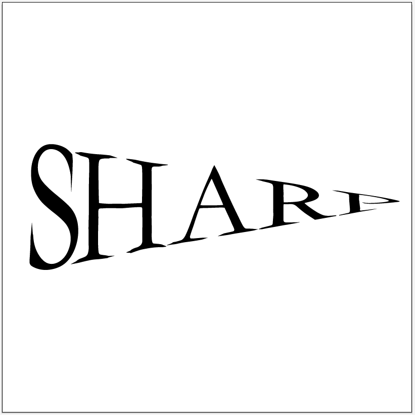
so after a bit of thinking i used an arc warp to make the word took like a very pointy/sharp object a bit like a blade of a knife.

Whisper
Definition of whisper: speak very softly using one's breath rather than one's throat, especially for the sake of secrecy. or a soft or confidential tone of voice; a whispered word or phrase.
In this expressive word i made the letter I look like a person who could be whispering or being told a whisper.
Font used: Baskerville
In this expressive word i made the letter I look like a person who could be whispering or being told a whisper.
Font used: Baskerville

After a while I thought that I could improve the whisper by making it a lighter colour by changing the opacity.
~~~~~~~~~~~~~~~~~~~~~~~~~~~~~~~~~~~~~~~~~~~~~~~~~~~~~~~~~~~~~~~~~~~~~~
Quote typography
Mood board
Having a look at different quote typography's by other people so I could get a good idea on how to make a good looking quote typography.

roughly sketching ideas for quote typography designs

Don't judge a book by it's cover

2 birds 1 stone

being honest may not get you a lot of friends but it will get you the right ones
and
Success is the sum of small efforts repeated day in and day out

Do something today that your future self will thank you for

If it's important to you you will find a way if not you will find an excuse
2 birds 1 stone


I really like this design it took me a while to make it because I had to create each blood splatter but the effect it makes looks really good.
Do something today that your future self will thank you for


Hand drawn
If it's important to you you will find a way if not you will find an excuse

I didn't like this one all that much so I redid it.


I made this one look like an if/else programming statement.
I thought this would be amusing to make because some people might not understand it because it looks like programming code.
Don't judge a book by it's cover

I think that these 2 turned out looking pretty good I especially like the way the second one looks with the cover type looking rough.

Success is the sum of small efforts repeated day in and day out

I really don't like this green one here it just didn't turn out as I planned it to.


I really like this one because of it's colours and because of how simple it looks.
~~~~~~~~~~~~~~~~~~~~~~~~~~~~~~~~~~~~~~~~~~~~~~~~~~~~~~~~~~~~~~~~~~~~~~~~
Making a visual cooking recipe for crêpes
In this part of the unit we were told to make a visual recipe for whatever food we wanted, I chose to do crepes as they are very simple to make and require few ingredients.
What is a crêpe ?
A crêpe is a type of very thin pancake made from wheat flour, eggs and milk and they can be served sweet or savoury. They are very popular throughout France.
A bit of crêpe history
A crêpe (pronounced /kreɪp/, French IPA: [kʀɛp]) is a type of very thin, cooked pancake usually made from wheat flour. The word, like the pancake itself, is of French origin, deriving from the Latin crispa, meaning "curled." While crêpes originate from Brittany, a region in the northwest of France, their consumption is nowadays widespread in France and is considered the national dish. Crêpes can be compared to the African injera, the tortilla, the Indian dosa and the Mexican sope. Crêpes often have a fruit filling of syrup, mixed berries, fresh fruit or lemon cream.
Information found from excusemyfrench.co.nz
Crêpe mix ingredients:
250g of flour
750ml of milk
and
3 eggs
Images of crepes, cooking tools and the ingredients needed to make the mix


A photographic step by step on how to make crepes that I did at home.
I ended up using most of these images to make my final visual recipe poster.

Font research to see what fonts would go well with my visual recipe.
it was quite difficult choosing from all these fonts because they all look like they could fit well in my poster.


adding in some images within blue circles and making the white line follow each image.

adding in the main title with the Eiffel tower to give it a French feeling to the poster

adding in decorative bite marks and changing the title a bit.

 Overall I think that this visual recipe works very well, there is hardly any writing making it very visual, it's easy to understand, it has a white line to follow each step of the making process.
And I personally think that the art style looks very appealing.
If I were to modify this poster I think that I would try to add more decorative visuals to it to make it look better but apart from that I don't think I would want to change anything.
During the Christmas holiday I got bored and decided to make an extra visual recipe on crepe fillings.
I made this in the same style as my other visual recipe.
This visual recipe just shows how you would cook a crepe with ham and eggs and how you would make a lemon and sugar crepe (sweet and savoury).


Making Festival posters
In this section of Unit 04 I was told to make 2 Bristol festival posters of a festival of my choice.
I decided to make posters for fictional festival called Digifest that would be a Digital art and music festival were people would go to the festival to discover new digital artists and musicians/DJ's by having a look at their art and listening to their music.

Looking at the visual elements in festival posters.
Festival poster are usually quite bright with a lot of colours and lots of designs to attract the viewers eyes, this is done so that the viewer notices the poster and learns more about the festival to find out if they may or may not go to the event in other words a festival poster is advertising (but a bit more artistic). having a look at these poster is good so that I have a better idea on how festival posters are shown and composed.

Looking a typefaces in festival posters to help me get a better idea on how I should present my festival name on the poster I will be making. I noticed that most festival posters have large titles so that when the viewer looks at the poster they can instantly know the name of the festival.

Bristol festival posters
Posters of festivals that have happened in Bristol.
Having a look at these posters is good so that I have a better idea on how festivals have been organised and shown on a poster in my home city.

Festival posters that are similar to the festival that I'm making a poster for.
Digital music festival posters usually contain a lot of small visuals and dark backgrounds.


Mood board on the type of art style on how I want my festival poster to look like.
It will have some kind of a digital/electronic art style.


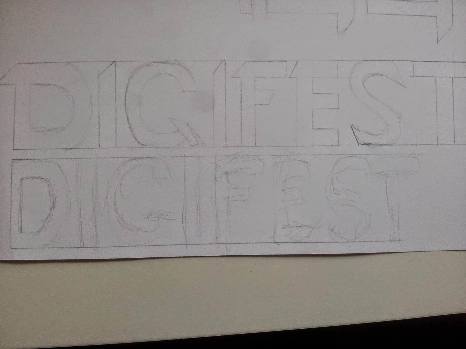
Experimenting and sketching 6 different fonts for the festival poster using the title Digifest.
I did this to give myself I better idea on how the title was going to look. They all look similar I should of experimented with a wider range of styles.

sketching out poster layouts, I might be using some of these layout for my final posters.
Doing this gave me a nice range of ideas to choose from.


Sketching visual elements for my posters.
The eyeball monster sketch is going to be the festival mascot.


This idea shows a computer monitor with the festival mascot on it and some speakers next to the monitor and a keyboard underneath.


After that I removed the background in Photoshop by using the magic wand tool and the eraser.
I did this because i didn't want the background to show up in my poster.


Making my First Poster


.png)

 Adding in some geometric shapes with overlay and 60% opacity to make them look nice and with the background.
 created and added a big speaker to the poster


~~~~~~~~~~~~~~~~~~~~~~~~~~~~~~~~~~~~~~~~~~~~~~~~~~~~~~~~~~~~~~~~~~~~~~~~
Making a visual cooking recipe for crêpes
In this part of the unit we were told to make a visual recipe for whatever food we wanted, I chose to do crepes as they are very simple to make and require few ingredients.
What is a crêpe ?
A crêpe is a type of very thin pancake made from wheat flour, eggs and milk and they can be served sweet or savoury. They are very popular throughout France.
A bit of crêpe history
A crêpe (pronounced /kreɪp/, French IPA: [kʀɛp]) is a type of very thin, cooked pancake usually made from wheat flour. The word, like the pancake itself, is of French origin, deriving from the Latin crispa, meaning "curled." While crêpes originate from Brittany, a region in the northwest of France, their consumption is nowadays widespread in France and is considered the national dish. Crêpes can be compared to the African injera, the tortilla, the Indian dosa and the Mexican sope. Crêpes often have a fruit filling of syrup, mixed berries, fresh fruit or lemon cream.
Information found from excusemyfrench.co.nz
Crêpe mix ingredients:
250g of flour
750ml of milk
and
3 eggs
Images of crepes, cooking tools and the ingredients needed to make the mix
Mood board of different crepe fillings, savoury and sweet.
Mood board of crepes in France and stuff like that. taking a look at some proper creperies from France.
Mood board of drawings of French cafes. getting ideas for a French looking art style.
Mood board of other visual recipes.
This mood board help me get a better understanding on how visual recipes should look and what they should include to make it look complete.
Drawings of the ingredients and stuff to make crepes.
I decided to sketch all the ingredients and steps it takes to make a pancake mix so I could then recreate these drawings into Adobe Illustrator.
Drawings of the different steps it takes to make crepes.
2 quick rough sketches of visual recipe layouts and designs.
In the end my final poster came out with a similar design to this first sketch so doing sketches of the layout did actually help.
Ingredients that i drew in Adobe Illustrator.
At first I was thinking of using these drawings for my final poster but than realised that photos would look a lot better and more natural.
A photographic step by step on how to make crepes that I did at home.
I ended up using most of these images to make my final visual recipe poster.
Font research to see what fonts would go well with my visual recipe.
it was quite difficult choosing from all these fonts because they all look like they could fit well in my poster.
Mood board/testing and experimenting with how I am going to show the ingredients.
this last mood board actually help me find out how i wanted my art style to look.
Visual recipe development
creating the background/layout.
To create the striped background i needed to look up a tutorial on how to make the pattern.
adding in some images within blue circles and making the white line follow each image.
adding in the main title with the Eiffel tower to give it a French feeling to the poster
final design with a few extra tweaks I added a drop shadow on the pictures and I changed the main title a bit.
And I personally think that the art style looks very appealing.
If I were to modify this poster I think that I would try to add more decorative visuals to it to make it look better but apart from that I don't think I would want to change anything.
During the Christmas holiday I got bored and decided to make an extra visual recipe on crepe fillings.
I made this in the same style as my other visual recipe.
This visual recipe just shows how you would cook a crepe with ham and eggs and how you would make a lemon and sugar crepe (sweet and savoury).
final design for the crepe fillings visual recipe.
In this visual recipe I really like the way the banner looks.
I think that these two visual recipes I made are very easy to understand for people that have never made crepes before and it gives them a nice understanding of how to make crepes and what kind of fillings that are good to put into crepes.
If I were to modify this second poster a bit I would try to adjust the title a bit to make the small writing a bit more visible.
~~~~~~~~~~~~~~~~~~~~~~~~~~~~~~~~~~~~~~~~~~~~~~~~~~~~~~~~~~~~~~~~~Making Festival posters
In this section of Unit 04 I was told to make 2 Bristol festival posters of a festival of my choice.
I decided to make posters for fictional festival called Digifest that would be a Digital art and music festival were people would go to the festival to discover new digital artists and musicians/DJ's by having a look at their art and listening to their music.
The process it took me to find what festival genre and title I wanted to use for my poster.
Digifest is just short for digital festival.
Looking at the visual elements in festival posters.
Festival poster are usually quite bright with a lot of colours and lots of designs to attract the viewers eyes, this is done so that the viewer notices the poster and learns more about the festival to find out if they may or may not go to the event in other words a festival poster is advertising (but a bit more artistic). having a look at these poster is good so that I have a better idea on how festival posters are shown and composed.
Looking a typefaces in festival posters to help me get a better idea on how I should present my festival name on the poster I will be making. I noticed that most festival posters have large titles so that when the viewer looks at the poster they can instantly know the name of the festival.
Bristol festival posters
Posters of festivals that have happened in Bristol.
Having a look at these posters is good so that I have a better idea on how festivals have been organised and shown on a poster in my home city.
Festival posters that are similar to the festival that I'm making a poster for.
Digital music festival posters usually contain a lot of small visuals and dark backgrounds.
Looking for good fonts that would be good for my festival poster
fonts found on Squirrel font and dafont websites. I was looking at more sci-fi esque fonts because i think that futuristic looking fonts would fit the digital side of my poster.
Mood board on the type of art style on how I want my festival poster to look like.
It will have some kind of a digital/electronic art style.
Another mood board on the type of objects and stuff that I might want to be included into my posters.
Stuff like pixel art, electronics, headphones, a monitor, and some kind of a dj setup (maybe).
I did this to give myself I better idea on how the title was going to look. They all look similar I should of experimented with a wider range of styles.
Doing this gave me a nice range of ideas to choose from.
Sketching visual elements for my posters.
The eyeball monster sketch is going to be the festival mascot.
3 rough sketches of some poster ideas I might be making.
This first idea shows hands reaching for some headphones.
This idea shows a computer monitor with the festival mascot on it and some speakers next to the monitor and a keyboard underneath.
This idea shows 3 speakers with the middle one being bigger then the other 2.
At first i didn't think much of this idea and I didn't like it that much but after I made it as one of my final poster designs I thought a lot differently about it.
Experimenting with types in Adobe Illustrator this helped me get a better idea of what kind of font i actually wanted for my posters.
Creating visual elements for the posters in Adobe Illustrator.
Making these was fun but I don't really know if I will be using many of them.
This guy here is the festival mascot he represents digital art and music; digital art because he is a piece of pixel art and digital music because he has a pair of headphones on.
I made this pixel art in Photoshop using the pen brush. I am really happy with the way it looks.
I decided to play around with my designs by trying to experiment with actual photos instead of just visual elements that I create myself with a computer.
I took photos of my hands and a some headphones I own.
After that I removed the background in Photoshop by using the magic wand tool and the eraser.
I did this because i didn't want the background to show up in my poster.
With these images I made a Paper Collage poster by printing out the images, cutting them out and then sticking them onto A3 card paper with glue, I then added some coloured card cut outs of music notes to show that the poster is about music and then I added in some clouds with the title on top of them.
I don't really think this poster looks that good but It doesn't look that bad either and it was more of an experiment than an actual finished poster. And I think that I could of improved it if I had thought of maybe using a blue coloured A3 card sheet as the background instead of a white one, to show that it is happening in the sky. With this poster you can mainly see the music side, it doesn't really show of the digital art side of the festival.
I decided to go and learn how to use Adobe Illustrator a bit better and acquire more knowledge to create better visual elements for my poster.
So I decided to learn how to use the mesh tool and other small tricks by following this tutorial: HERE
And by following that tutorial I created this great visual image.
The tutorial helped me a lot and thanks to it I have thought of so some new ways I could improve my poster designs.
Making my First Poster
Using the mesh tool to create this lighting effect
using the pen tool to create these lines and then used an overlay so it blends well with the background
Adding in some half tones and the festival mascot
Adding in some more (smaller) half tones and a place for text with a drop shadow.
added the title and some text but I wasn't quite happy with the
way it looked yet the title looked too simple
Here I modified the title to look more appealing and overall more interesting.
I had fun making this first poster and I really like the way it turned out.
I think that this poster really fits as a music and art festival, you can instantly see that it is a music poster from the headphones that the mascot is wearing and you can kind of get an idea that it is an art festival from the fact that the mascot is a pixel art piece. what i like most about this poster is that it actually looks quite professional, it is the kinda of poster you would see in the street or online.
Making the 2nd Poster
I wanted to try making my 2nd poster with Photoshop so followed some Photoshop tutorials thinking that it might be easier to come up with good ideas if I used Photoshop... well I was wrong. So I decided to then just stick with Illustrator.
I made this unfinished poster with adobe Illustrator. It's unfinished because while I was making it I realised that it really didn't suit the theme of the festival, it wasn't showing anything musical or digital so this poster was a fail. But I do kind of like the way it looks. It looks a bit more like a punk/rock festival poster. other than that I think that it could of looked really good if I had developed it more.
Making my second poster
This poster is based off of my third poster sketch.
Started off with a black background which I applied a purple mesh to it.
Added some smaller speakers to the side of the big one and added in some small details.
Adding in the title of the festival but wasn't yet sure of were to place it
And here is the final result with the title at the top and the info at the bottom.
Overall I think that the poster looks ok but it is no way close of looking as good as my first poster. If I had more time to experiment and improve this poster I think that I would completely redo the background to try and make a bit more visually pleasing and eye catching and make the title and info look more appealing. My biggest problem with this poster is that it only shows off the music part of the festival and not as much the digital art part. I don't think that this poster looks as professional as my first one.